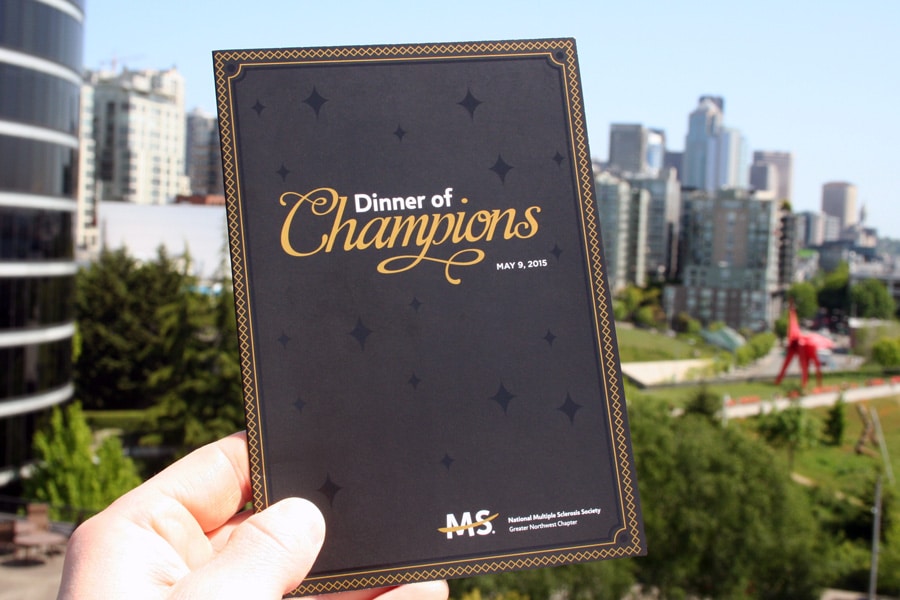
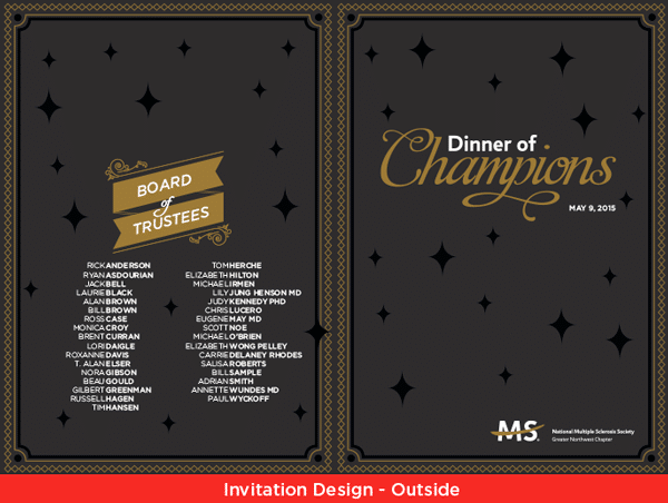
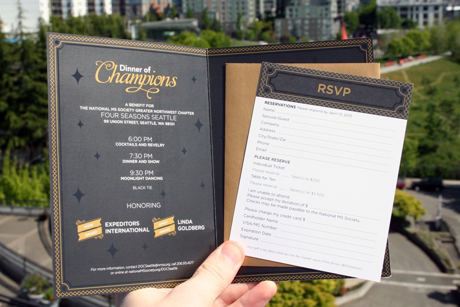
It is not uncommon for a project to come across our plate that utilizes multiple aspects of our specialized print services. A good example of this is the invitation we printed for the National MS Society’s Dinner of Champions fundraiser event. The National MS Society is a non-profit organization that raises hundreds of thousands of dollars for MS research and awareness. They needed a high quality printed invitation for their event. Something that was attention grabbing and elegant, and able to meet their strict budget criteria.
The fine folks over at DNA Seattle provided the fantastic design. We worked with them throughout the project to meet the budgetary and print quality concerns of the National MS Society.
Tracy Wreden was the AlphaGraphics account manager on the project. She did a wonderful job seeing the project to fruition and meeting all the client’s needs along the way.
The completed invitation involved a total of five different print pieces. Let’s break them down individually to see how it all came together.
Main Invitation
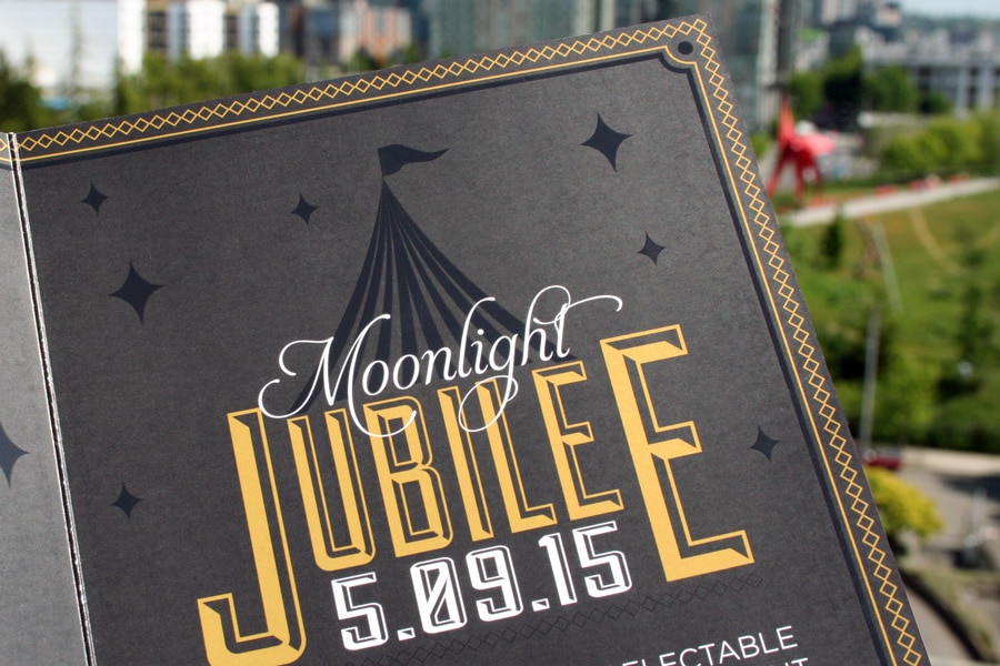
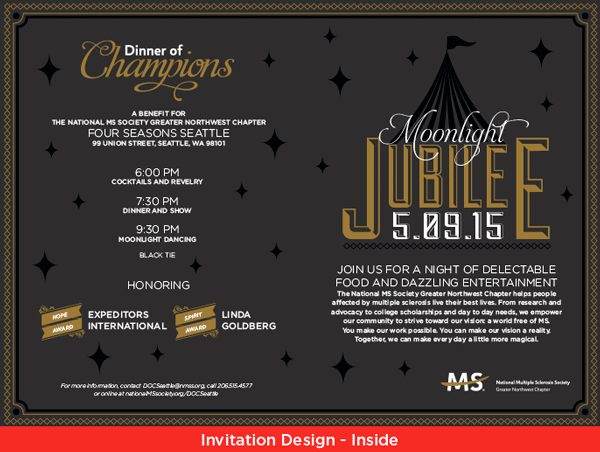
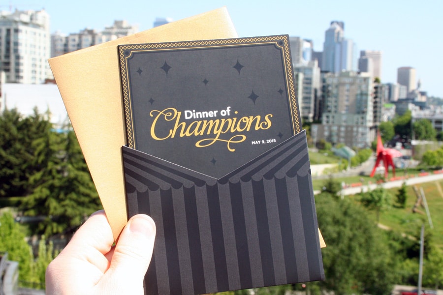
The invitation is the centerpiece of the project. It required a few special elements and some extra care to create the desired visual impact.
- The use of specific Pantone color (for the gold lettering – Pantone 8640C)
- Spot UV (for the stars and border on the design)
- Silky smooth texture and rich blacks
We produced the Pantone color and the deep blacks by using our Komori offset printer. A silk paper stock made the invitation smooth to the touch and added a subtle shine. The paper stock aided in two other ways. It made the Spot UV effect stand out, and it created extra contrast between the white lettering and the other design elements. The white you see on the lettering is the actual color of the paper stock.
Invitation Holder
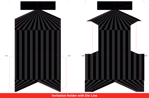
The first thing you will notice about the invitation holder is the beautiful die cut. Our prepress department did a fine job preparing the design file to cut out the holder’s tent-like shape. It was digitally printed on the Igen press with a thick silk paper stock to match the texture of the invitation.
RSVP Card Inserts
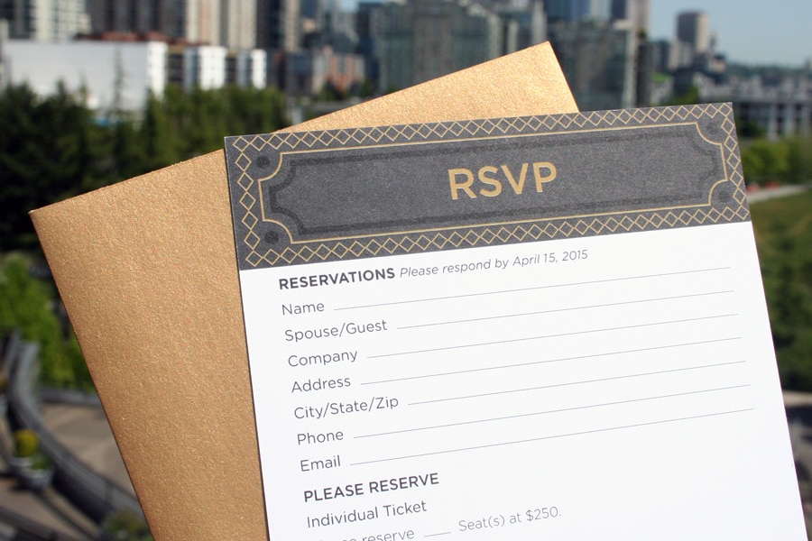
There were three main goals to meet with the RSVP insert cards:
- Be cost effective without sacrificing print quality
- Match the black and gold color of the main invitation
- Be easy for people to physically write on
In this case, the most cost effective way to get a premium print would be through digital printing. The Igen was our first choice. Though after testing we realized that the gold color wasn’t matching quite right with the gold color of the invites. We made the switch to the Indigo press and were then able to produce the results that the client was looking for. The 13.9pt matte paper stock ensured that the invitees could easily write on the inserts to request their spot at the big event. (FYI: it sold out!)
Small RSVP Envelopes
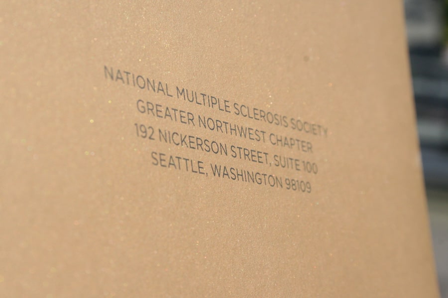
A metallic gold envelope was selected that worked well with the overall presentation of the invitation. The National MS Society address was printed on the front with the Heidelberg, a machine that specializes in envelope printing. Additionally, our prepress made a slight modification to the design. By switching to a heavier font weight we dramatically increased the legibility of the printed text over the metallic gold.
Invitation Envelopes
The same gold metallic colored envelopes were used for the invitations as the RSVP invite cards, only bigger. This piece of the project, however, required variable printing. The invitations were going out to 800 invitees each needing a unique address printed on the front of the envelope. The digital Xante press was used just for that reason, capable of variable printing from a database. A second pass was necessary to print the return address on the reverse side.
Assembly
Once all the pieces were printed, our binding team went to work on assembling it all together. The RSVP insert cards and RSVP return envelopes were both placed inside the invitation. Next, the invitation was inserted into the holder, which was then put inside the invitation envelopes.
This finished project required the use of five different printers, both digital and offset. Needless to say, the client was more than satisfied with the end result.
Needless to say, the client was more than satisfied with the end result.
“I found a stack of invites on my desk this morning and just have to say WOW. They are truly beautiful and I have already received an email from a Table Captain saying as much. Not only that, but a slew of reservations came in online over the weekend, prompted by this gorgeous piece no doubt.
I am full of gratitude this morning for your talents and generosity…. I am overjoyed that we were able to print twice as many invitations this year for half the cost of the 2014 invite without having to compromise on design, quality, feel. Thanks to Tracy and team at Alpha. Thanks to all of you.”
— Laurie Johnson, Director – Individual and Foundation Giving
Having the opportunity to work on projects like this and being able to exceed customer expectations is why we love working in the print business.
If you have a project that needs printing don’t hesitate to get in touch. We would love to work with you.
(206) 552-9952
contact@alphagraphicsseattle.com

